Visionaire 5 RC0 released!

  • #20, z afrlmeFriday, 14. April 2017, 15:01 hodinky 8 years ago
    @dev team
    here some ideas to to scenes, items and interfaces icons:


    I also changed the house icons for scenes because it could be misinterpreted to lead to the "home" screen ore something like that...
    Nice! smile

    Imperátor

    7285 Posts


  • #21, z sebastianFriday, 14. April 2017, 15:17 hodinky 8 years ago
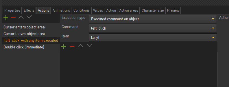
    Im a bit confused: there is an "Actions" tab for the objects which get content when clicked on a scene object. ALso there is an "Action" which seems to be for the scene actions but only filled with content when a scene action (e.g. beginning of the scene) is selected.

    https://cl.ly/2R3n3G0R0W3K/Image%202017-04-14%20at%203.05.10%20PM.png

    Now the scene actions get mixed up with the scene object area which is ... lets say weird razz

    Would it be possible to label all the "action(s)" tabs to its corresponding usage?


    I experienced the same weird "action" tab in the characters workspace on the right. After minutes of searching i found out that it lists the action parts which get called in a dialog selection... When pressing the "blitz" icon it opens the dialog part action anyway. So it looks a bit double used

    Kapitán

    2346 Posts

  • #22, z TinTinFriday, 14. April 2017, 15:25 hodinky 8 years ago
    Nice Job!!!. Thanks a lot for release

    Two Questions :

    1) How is it work 'Turn animations'?
    2) Lua script editor in beta was highlight coloring . I don't see it in this version .Why?
     

    Fanoušek fóra

    196 Posts

  • #23, z marvelFriday, 14. April 2017, 15:43 hodinky 8 years ago
    @dev team
    here some ideas to to scenes, items and interfaces icons:


    I also changed the house icons for scenes because it could be misinterpreted to lead to the "home" screen ore something like that...
    Nice! smile

    I'm fine with the icons for items and interfaces. What I don't like is the item for the scenes/rooms. It's too complex smile

    Zabiják klíčů

    599 Posts

  • #24, z sebastianFriday, 14. April 2017, 16:03 hodinky 8 years ago
    @dev team
    here some ideas to to scenes, items and interfaces icons:


    I also changed the house icons for scenes because it could be misinterpreted to lead to the "home" screen ore something like that...
    Nice! smile

    I'm fine with the icons for items and interfaces. What I don't like is the item for the scenes/rooms. It's too complex smile

    maybe some kind of these in a minimalistic version?:
    (because of the word "scene" it also reminds me of these)

    EDIT:

    Kapitán

    2346 Posts

  • #25, z ke4Friday, 14. April 2017, 16:07 hodinky 8 years ago
    I like the diamond icon razz Feels better than the ball. What i think is important to keep the good look is to get the line width same for all icons.

    Zabiják klíčů

    810 Posts

  • #26, z marvelFriday, 14. April 2017, 17:03 hodinky 8 years ago

    maybe some kind of these in a minimalistic version?: (because of the word "scene" it also reminds me of these)

    EDIT:

    I don't think so. It's kind of misleading. Looks like "video" or something. Personally I am fine with the small house icon. But I am openminded for any improvements....

    The small diamond is fine, yes. smile

    Zabiják klíčů

    599 Posts

  • #27, z F_KalFriday, 14. April 2017, 17:14 hodinky 8 years ago
    I like the clapperboard, it does remind of a set/stage/scene - but the home icon is okay too!
    I'd suggest a theater stage/movie set icon though (a courtain or background set, perhaps a director's chair/camera/audience/spotlight)... and action!

    Fanoušek fóra

    107 Posts

  • #28, z PaupasiaFriday, 14. April 2017, 17:18 hodinky 8 years ago
    First of all thanks for solving the scaling of the editor in low resolutions! grin

    I tried to build one of my games and I stumbled upon these problems:

    1)  All my particles are gone.

    2) It does not detect the custom icon

    3)  do not automatically download the Mac platform, I downloaded and inserted manually, but the editor does not see the Mac platform

    4) Building the game I can't create subfolders and all the scenes, objects etc are listed together with the .exe file

    5) Old bug not solved. The scenes fade effects are weird.
        When using "fade in" "fade out" "fade to scene" I don't get a smooth transition but one Flash between the two scenes, even with a delay of 1000 ms. 


    Fanoušek fóra

    165 Posts

  • #29, z afrlmeFriday, 14. April 2017, 17:25 hodinky 8 years ago

    maybe some kind of these in a minimalistic version?: (because of the word "scene" it also reminds me of these)

    EDIT:

    I don't think so. It's kind of misleading. Looks like "video" or something. Personally I am fine with the small house icon. But I am openminded for any improvements....

    The small diamond is fine, yes. smile

    What about some kind of minimal mountain icon for scenes?

    https://thumbs.dreamstime.com/z/mountain-icons-set-vector-landscape-white-35942045.jpg

    https://s-media-cache-ak0.pinimg.com/originals/48/de/2c/48de2c2c4dbc4349d8f74d319546a763.jpg

    https://thumb1.shutterstock.com/display_pic_with_logo/3186653/282657428/stock-vector-landscape-icon-set-282657428.jpg

    https://s-media-cache-ak0.pinimg.com/originals/a8/fd/e0/a8fde0da395a4dc3cf8a4378913d496c.png

    Imperátor

    7285 Posts

  • #30, z sebastianFriday, 14. April 2017, 17:26 hodinky 8 years ago
    I don't think so. It's kind of misleading. Looks like "video" or something. 
    yeah, you are right... Didn't thought about that...

    Kapitán

    2346 Posts