Visionaire 5 Public Beta Test now live!

  • #120, z MachtnixThursday, 09. February 2017, 19:14 hodinky 8 years ago
    I can't make screenshots, because I use the 64-bit PC with Linux mostly. It's only remarkable on the dialog texts in the text areas for dialogs, I remember.

    But the Text there is blackest black, Machtnix. See attachement. Where do you see grey colors there? smile


      It wasn't in this box. I am going to look after, maybe tomorrow.

    Kapitán

    1097 Posts


  • #121, z LebosteinThursday, 09. February 2017, 20:24 hodinky 8 years ago
    I already responded to this a few posts before. wink We've had plenty of icons all over the editor. In order to reduce and simplify the layout, we removed the icons as you can simply do it by CTRL + C / CTRL + V... Duplicate is F4... probably be changed later to CTRL + D

    What about a simple right click popup menu with copy, paste duplicate (as you would expect)? Hidden key combinations (yes, the keys are well known in nerd circles) is a bad way of usability.

    PS: My first attempt to find these functions was a right click on an item. Unfortunately unsuccessful.

    Zabiják klíčů

    621 Posts

  • #122, z marvelThursday, 09. February 2017, 20:37 hodinky 8 years ago
    Sure, why not... but Simon is the man. He must check if it is possible to add a right click context menu there smile

    Zabiják klíčů

    599 Posts

  • #123, z LebosteinThursday, 09. February 2017, 20:50 hodinky 8 years ago
    Sure, why not... but Simon is the man. He must check if it is possible to add a right click context menu there smile
    ;-) There is already one (with "Finde Referenzen", "ID kopieren", "LUA Pfad kopieren"...) You need only to add a separation line and the commands "copy", "paste" and "duplicate"

    Zabiják klíčů

    621 Posts

  • #124, z TinTinFriday, 10. February 2017, 18:11 hodinky 8 years ago
    Another issue :  'Animation studio ' in character tab, doesn't work play button ,forward,... and 'adjust to 'and even OK or Cancel buttons for me.

    Fanoušek fóra

    196 Posts

  • #125, z MachtnixFriday, 10. February 2017, 19:47 hodinky 8 years ago
    Habe zwei Screenshots mit grauem Text herausgesucht. Für mich ist das Grau (leider) bereits grenzwertig und anstrengend zu lesen. Man sieht auch in der Kopfleiste die eng zusammengedrückten Icons - es ist schwierig, ganz schnell und "mal eben" das Menü zu wechseln; das war vorher besser.

    Two screenshots with grey text; it's hard to read for me.
    In den header bar the icons are without space; it's not easy to find the correct icon immediately.

    https://abload.de/img/screen5betawdrww.jpg

    https://abload.de/img/screen5betascript-edi51rbs.jpg

    Kapitán

    1097 Posts

  • #126, z afrlmeFriday, 10. February 2017, 21:04 hodinky 8 years ago
    The icons should have space between them but it seems whatever size your monitor is or if you have resized the window, that the icons have been compressed together, thus overlapping. They look fine on my 1080p monitor.
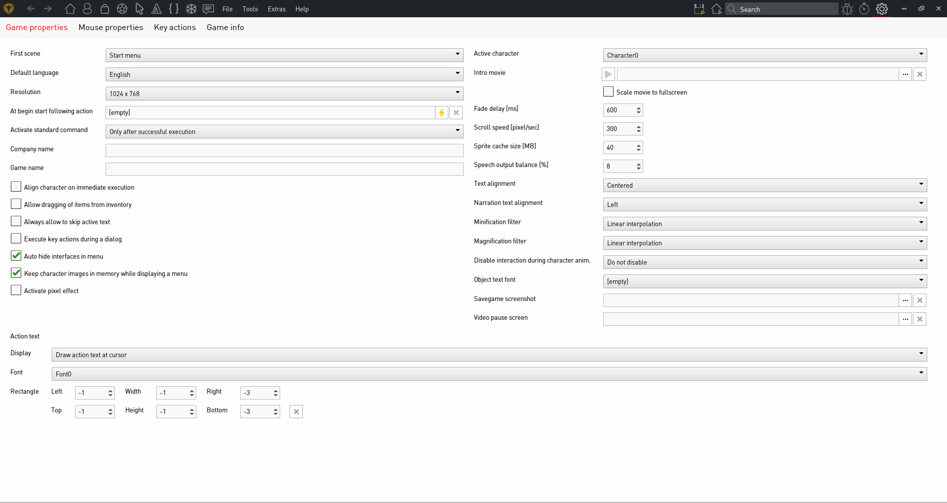
    https://i.gyazo.com/2c6e292e2add6ee0a136f72a1b931486.png

    The grey text is color syntax. That's typical. Maybe it would be possible when Simon sorts out some themes that the color syntax theme could also be selected or maybe it already is possible in the xml data - unless it's internally coded in the editor source code?

    Actually I believe it is. Inside of the folder you installed visionaire studio 5 beta to is a skins folder. I'm not sure if we are using theme 1 or 2, but inside of each is a skin file which you should be able to edit with a text editor like sublime text, atom or notepad ++ or maybe even regular notepad. There's also an xml skin file in folder 2, but I assume the correct folder is 1 & that the skin file is the correct file to edit.

    script {
    background:#FFFFFF;
    caret : #000000;
    foreground : #000000;
    invisibles : #BFBFBF;
    lineHighlight : #00000012;
    selection : #BAD6FD;
    
    string:#4541fE;
    comment:#919191;
    keyword:#F92672;
    field:#AE81FF;
    unknown:#FF5600;
    knownglobal:#00A33F;
    
    upvalue:#56c802;
    
    error:#ff0000;
    scope:#cccccc;
    scopekeyword:#ffcccc;
    masking:#111199;
    autocomplete:#ffff33;
    masked:#00ff33;
    warning:#ffff00;
    deadcode:#991111;
    }
    
    actionparts{
    scenes:#ac7c1d;
    characters:#c55f14;
    interfaces:#007330;
    items:#166969;
    cursors:#069e63;
    fonts:#54378a;
    scripts:#006ea2;
    particles:#82ad00;
    texts:#8e3355;
    actions:#102ea2;
    strings:#666;
    item:#aaaaaa;
    }

    If my thinking is correct then technically you can edit the editor colors how you see fit. Would actually be interesting to see what other users come up with.

    P.S: a lot of editor stuff can actually be edited in the xml files under the xml folder, which includes translations of all the texts belonging to the editor.

    P.P.S: gyazo isn't currently working hence the attached image rather than inline.

    Imperátor

    7285 Posts

  • #127, z MachtnixFriday, 10. February 2017, 21:24 hodinky 8 years ago
    The icons should have space between them but it seems whatever size your monitor is or if you have resized the window, that the icons have been compressed together, thus overlapping. They look fine on my 1080p monitor.


    Maybe. But I haven't one. My size is 4:3. So there is space enough to the right, it should be possible to give them more distance between.

    Thanks for the xml-hint. I will try to change the colours.

    BTW: I don't know how this forum quote thing works... roll Sometimes I can write only in this grey block.

    Kapitán

    1097 Posts

  • #128, z afrlmeFriday, 10. February 2017, 21:44 hodinky 8 years ago
    Forum quote thing seems to be a bit buggy. Try clicking mouse underneath it or selecting source button to see the html/markdown code stuff.

    As for the theme/skin file it's the one titled "skin" in folder 1 under skins in c > program files (x86) > visionaire studio 5 beta

    P.S: found this online site for trying out colors for various keywords, backgrounds & such. http://tmtheme-editor.herokuapp.com/#!/editor/theme/Monokai

    Monokai is the theme I use for Sublime Text 3. Obviously this is just for script section of the theme, but there's more things in the skin file you can edit & the nice thing is that it seems to be CSS which is very common & quite easy to use/learn. Anyone that's done any web design / development over past 10 years or so probably knows a bit of CSS as it's the most common method of creating themes for websites.

    P.P.S: you can also replace the icons / graphics of the editor if you like, though it might require editing both the xml & skin files in some cases. The only problem is that you would probably need to edit the files each time a new update is released in case of new elements which would be a pain in the arse, unless a theme/color editor is included in the tools/properties section or an executable theme editor included with the engine installation or something to make it simpler to edit things rather than messing with the files.

    Imperátor

    7285 Posts

  • #129, z MachtnixFriday, 10. February 2017, 22:09 hodinky 8 years ago
    Yeah, I already found it. There is a xml- and a css-file. But it's not important to do this now.

    The editor isn't wysiwyg, I can't see what I have done, you are right: it's better to use the sourcecode.

    Two other remarks:

    Way systems: If I zoom in I can't scroll with scroll bars. They are visible, but inactive. With mouse wheel it's possible to scroll up and down, but not to the left and to the right. Must be fixed, well?

    Pressing the animation arrow (green) to start animations, animations run all the time, even I leave the scene area.

    Kapitán

    1097 Posts

  • #130, z MachtnixFriday, 10. February 2017, 23:47 hodinky 8 years ago
    The first main problem of the 5 beta editor is: there is no sound! No background music, no sound, no voices. Neither in the player running the game nor in the sound previews. I don't know why. I'm looking after the system requirements and the hardware to use. Maybe it need a simple solution, but I have no idea. The same game runs correctly in 4.2.5. Yes, I saved the game in the new 5 beta format before.

    But I have only one game to test on my Win7 system, maybe it's the fault of exactly this game. I used ogg files mostly (no mp3!).

    The second main problem is: a large animation wasn't loaded. It's gone, anywhere in the editor. All links are broken. In 4.2.5 the webp version wasn't transparent, so I had to use the png version with alpha channel. It's a huge one, but it works in 4.2.5.

    Loading the animation manually, the Vis 5 beta crashs.

    A little problem after all: I can't see which file is actually open in the editor. Not in the tab bar, not in the header of the editor. That will be make mistakes if I use several different files with different values.

    Kapitán

    1097 Posts